Team Planning
Overview & Challenge
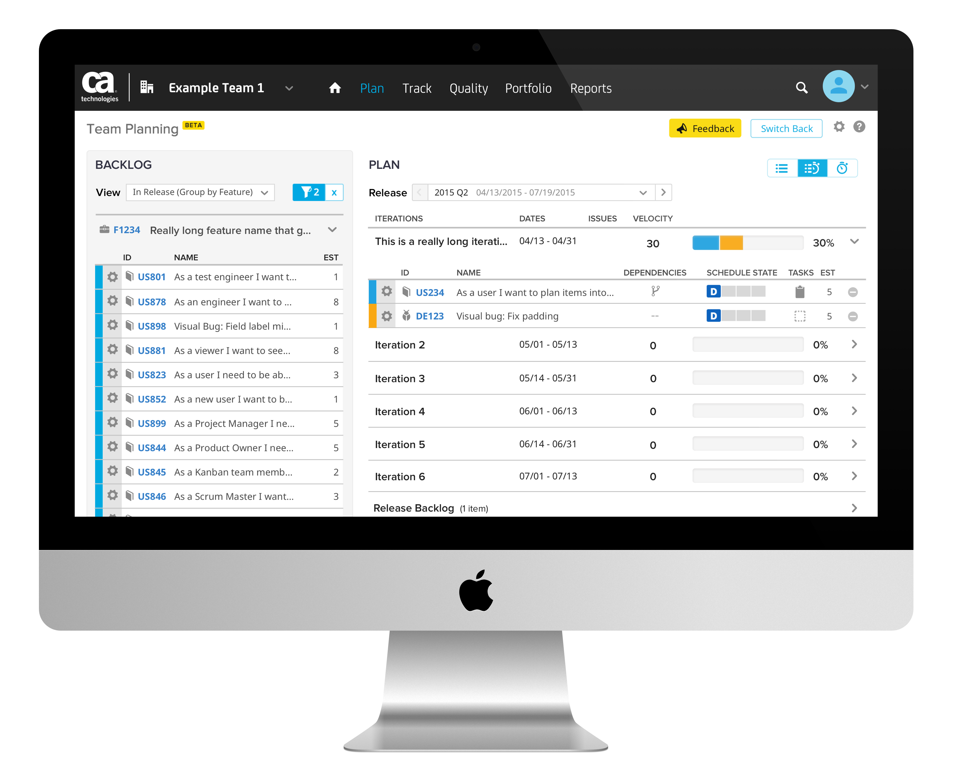
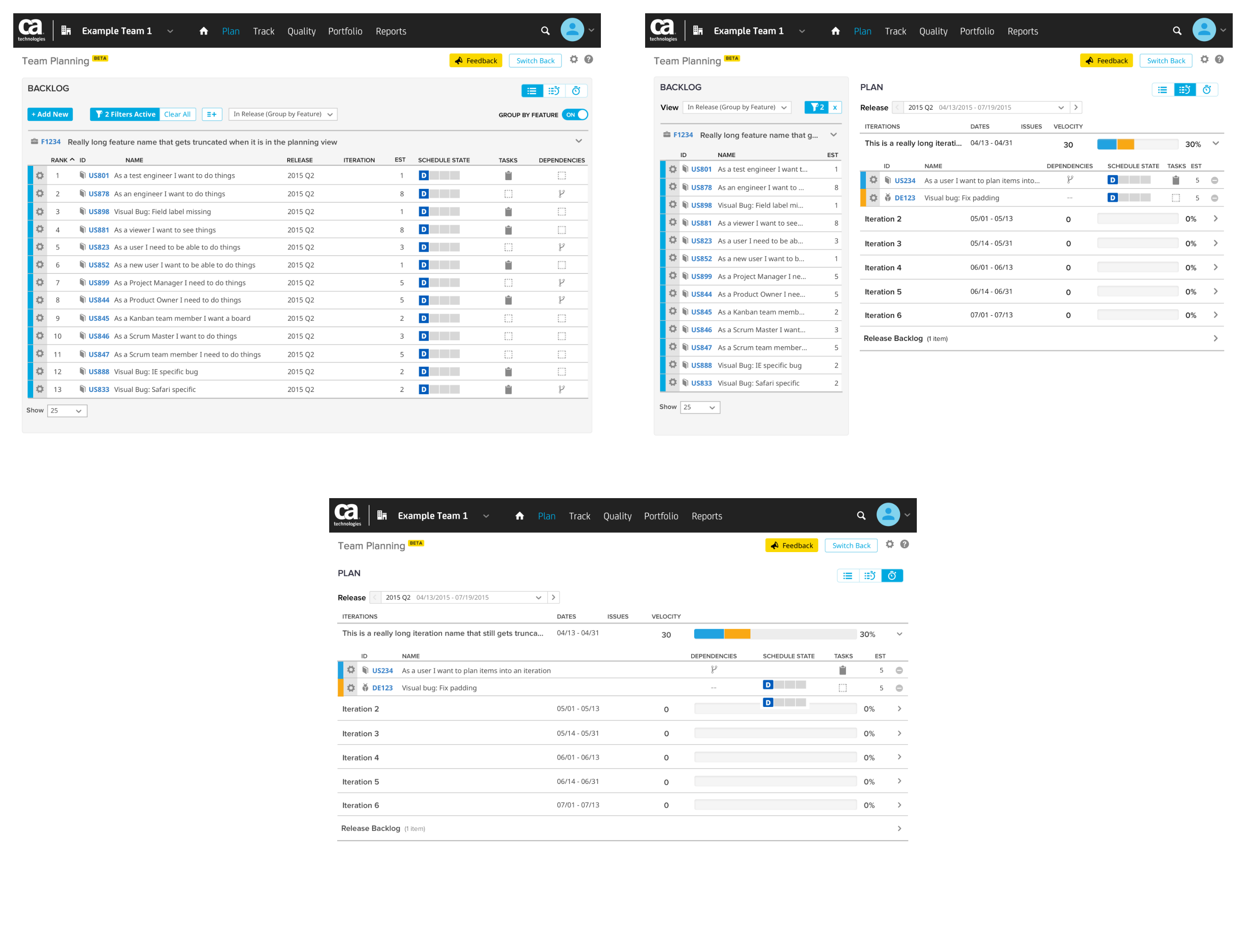
CA Agile Central (formerly Rally Software) is a collaborative, enterprise SaaS platform for agile software development. Within the platform teams plan, prioritize, and track their work. The Team Planning page is used to schedule work pulled from the team’s backlog into iterations. It allows one to easily view the velocity of work items in a given iteration and show if the team’s workload is over capacity.
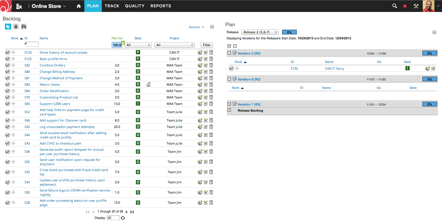
The goal was to achieve a retention rate of over 70% for the Team Planning page. This would allow it to ascend from closed beta to open beta. After open beta it would eventually replace the Plan page. It was important to keep feature parity between the two pages in mind throughout development. This would ensure that once people were switched over, they wouldn’t be losing any functionality and instead be gaining features and a more usable experience.
Details
Research
When I was put in charge as head designer for the Team Planning page it was crucial that I gained a better understanding of how it worked and interacted with the rest of CA Agile Central. It was also important to be aware of the previous design iterations and testing that the page had gone through.
Default Dropdown Views
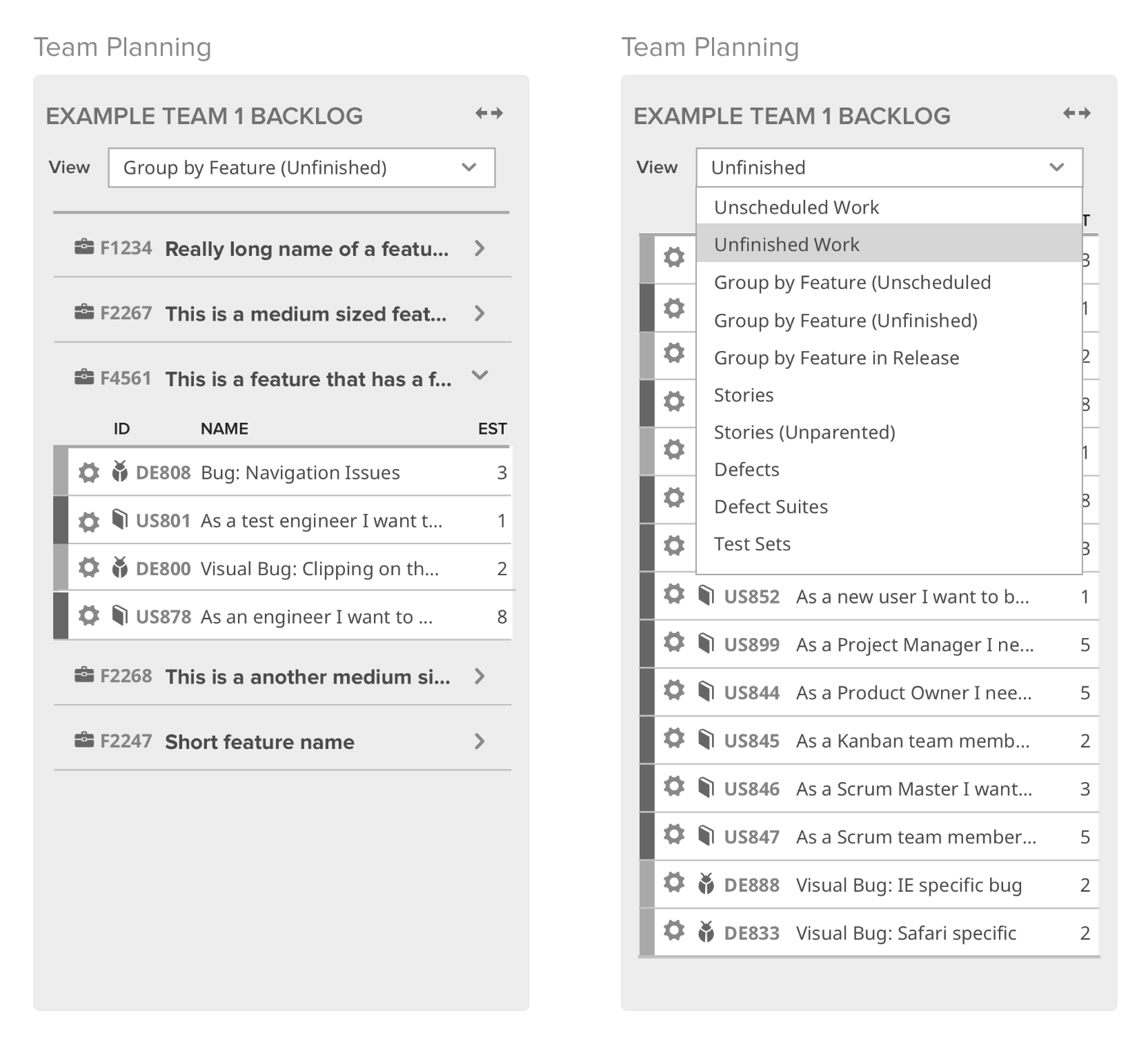
In collaboration with the product owner and user researcher, we established a set of default dropdown views that would filter work in the backlog panel.
At this point in time the Team Planning page was not equipped with advanced filtering, so it was important that we provided helpful defaults in the interim. The creation of a spreadsheet of what work items would appear in these views under different circumstances revealed edge cases that were then addressed in the following views:
- Unscheduled Work
- Unfinished Work
- Group by Feature (Unscheduled)
- Group by Feature (Unfinished)
- Group by Feature in Release
- Stories
- Stories (Unparented)
- Defects
- Defect Suites
- Test Sets
User Interviews
Customers that were in our closed beta from various companies of different sizes were recruited for user interviews. The variety of customers allowed for a broader range of use cases. The questions that were asked were:
- “What default views would you expect to see in the backlog?”
- “What default views would you want in the backlog and for what use cases?”
- “What does ‘Unfinished Work’ mean and what work items would be included in this view?” (asked for each view)
- “Of these views, which would you or other members of your team find helpful? Why?”
Our key findings from these interviews were:
- Customers felt they only had a need for 1 or 2 of the views
- There were variations on which few views were helpful from customer to customer
- All of the views ended up being indispensable due to strong use cases existing for each view
- Customers generally understood the views and what work items would be included in them
Page Layouts
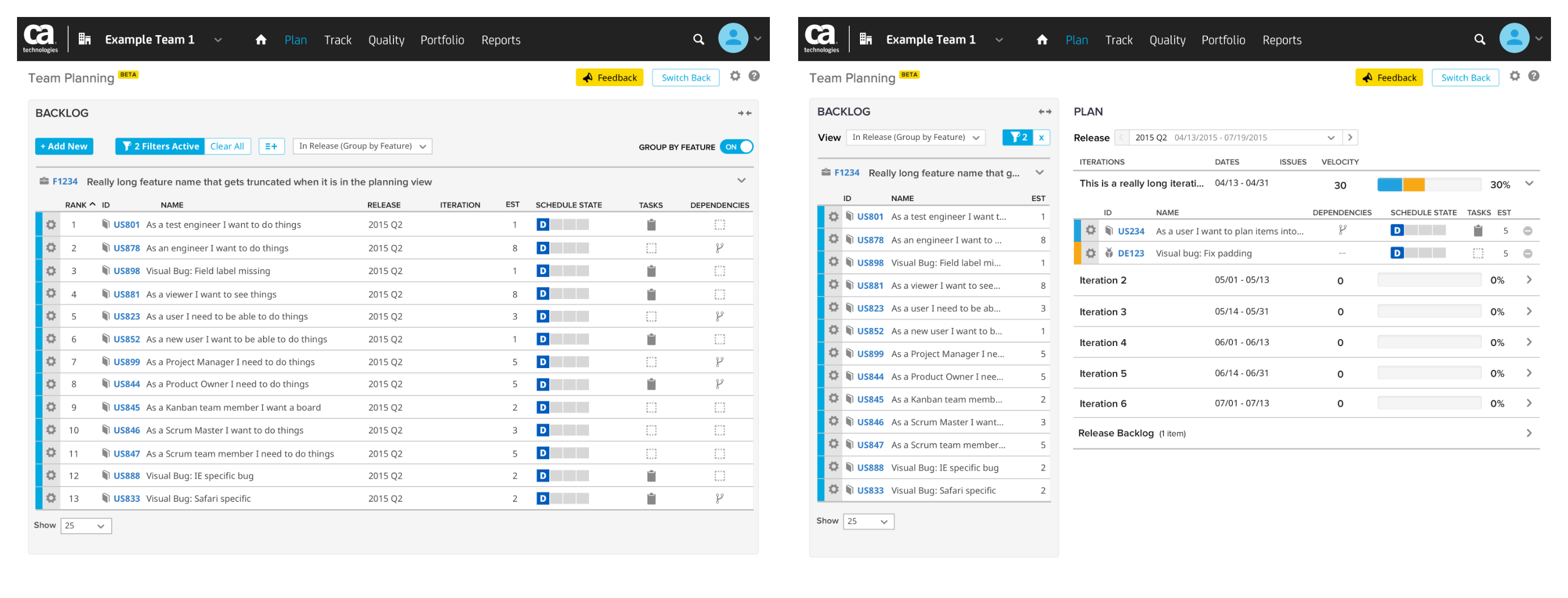
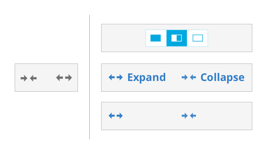
An icon existed in the backlog panel that would expand it to the full width of the page. The product data hub (shows feedback from customers) revealed that discoverability of this icon was a definite issue. Mockups of ways to improve the current icon’s visibility as well as mockups of new UI solutions were to be tested.
Usability Testing
One of the layout switchers that we tested was consistent with UI elements present on other pages within CA Agile Central. This option would add a third layout option if it tested well. A couple options to improve the discoverability of the preexisting icon were also to be tested.
The layout switcher present on other pages proved to be more discoverable than the alternatives and tested better overall. We decided to implement this UI element and explore it further as we received additional feedback.
User Interviews
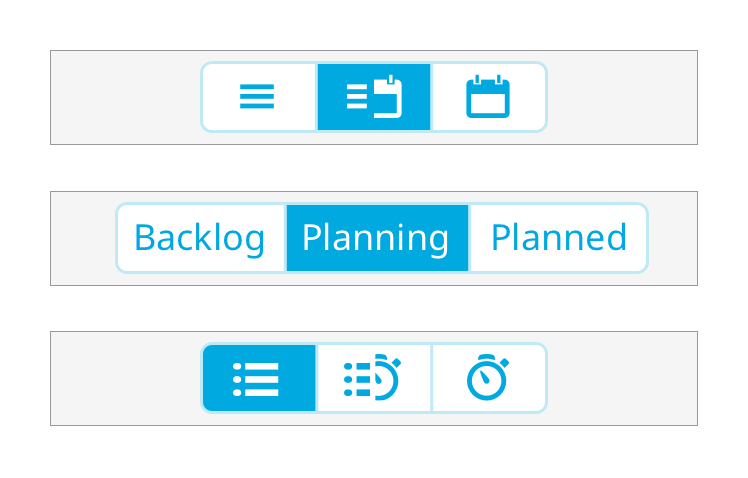
At this point Team Planning had reached a retention rate of over 70% and was opened up to all customers. The feedback that we received showed that while the layout switcher was discoverable, the icons being used were not well understood. Additional customers were interviewed about new icon sets as well as a word toggle.
Interviews revealed the following trends:
- The set that tested best used a preexisting list icon which was easily understood by customers, allowing them to infer what the other icons meant through context
- Despite our hypothesis, words did not test well and customers were more confused by them
After much of the product data hub feedback had been addressed through various page alterations, the remaining bulk of feedback was centered around data density. Customers wanted to see more items on the page and felt that vertical screen real-estate was being wasted.
Team Planning Bigger Picture Exploration
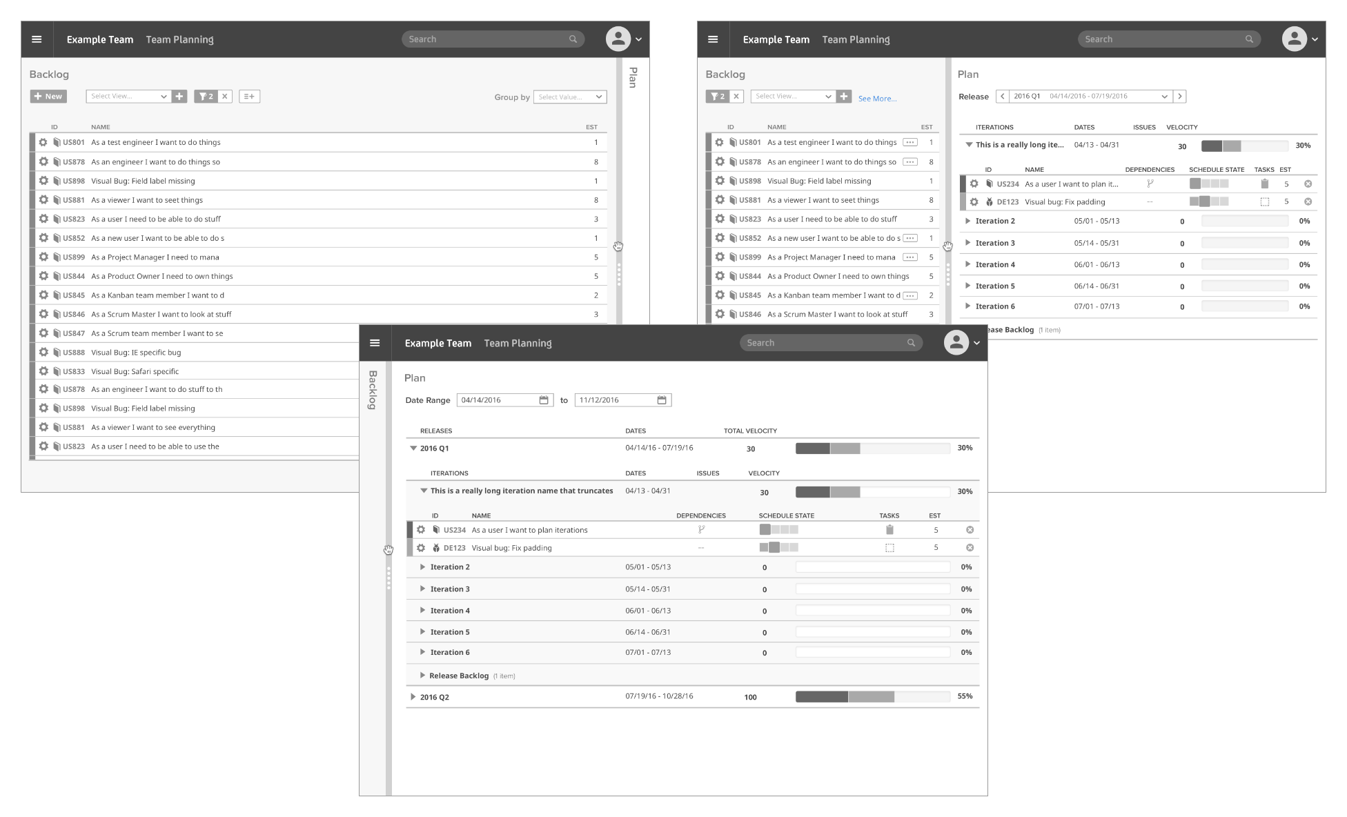
The team decided that a logical next step was to revisit the Team Planning page from a big picture approach in a way that aligned with other future work being designed. The core of the page was kept intact as it was testing well with customers and receiving mostly positive feedback.
After designing various wireframes, the team landed on a more customizable experience. The page was to allow the panel separator to be dragged to the left or right to the desired page ratio. The dragging action was consistent with how the page worked as a whole as team members drag work items from the backlog on the left to the iterations on the right during planning. This would give customers the ability to see the data they cared about more easily, and fixes some of the issues centered around data density.
Final Design & Status
The Team Planning page was handed off to another team due to work priority shifts in the company. It’s still in open beta and continues to be improved upon.
